More pictures of the new Mercedes A-Class
Last Updated:
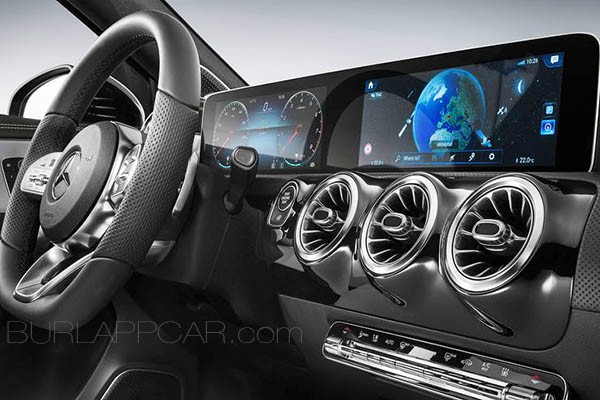
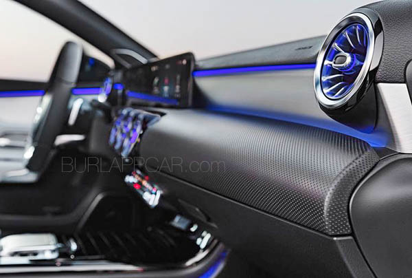
This time in black, with metal trim. (Something I don’t like…)
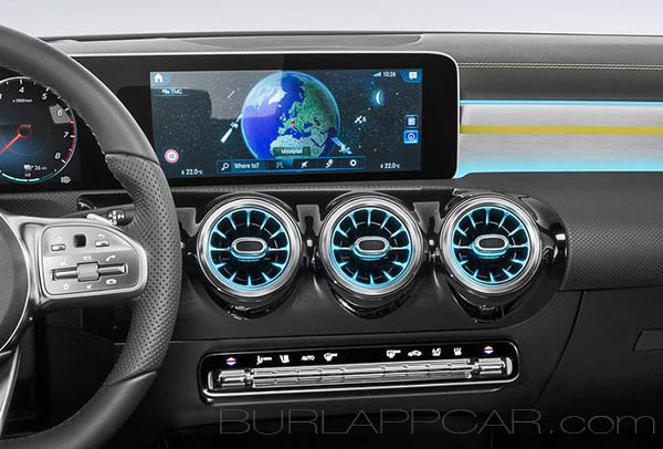
But it has a good view of the screen, with appears to be pretty much the same as in the E-Class.
Which is pretty impressive…
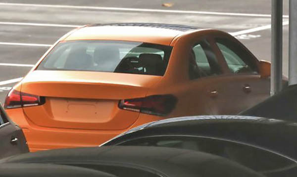
Here is the exterior of the car.
Which looks a lot like the current generation, despite being all new.
And here is the sedan we are getting in the US.
Not that exciting… Basically the same car as the A Sedan Concept we saw a while ago.
And not more modern than the current CLA…


I was just having a conversation with someone about Tesla vs. Mercedes interiors. I prefer the minimalism of Tesla, and he preferred the "opulence" of Mercedes. Frankly, I don't consider fragrance canisters and blue lighting that resembles a New Jersey reception hall to be all that opulent. Or air vents that look like sphincters. I find Mercedes interiors to be low-rent and vulgar. Not because they're cheaply done, but because the design is overwrought and cheesy. Give me the teutonic and sterile MB interiors from the 80s any day over this.