All new 2018/19 Mercedes A-Class interior
Last Updated:
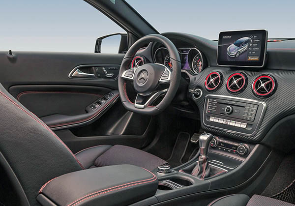
While the exterior of the all new A-Class doesn’t seem that different from the current model, it is not the case inside. (exterior spy shots HERE)
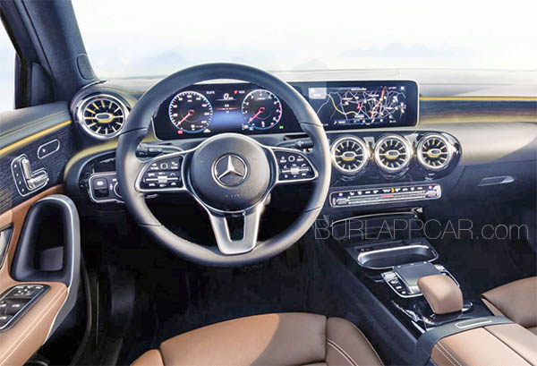
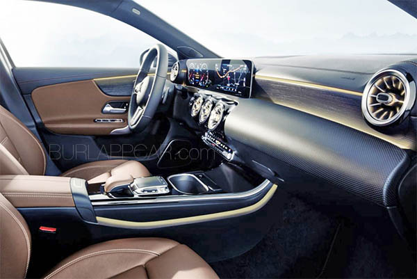
As you can see, this is a huge improvement. (Our CLA & GLA share most of the current A-Class interior)
This now looks more like a smaller E-Class interior.
With both futuristic and retro touches.
And at least, no more “tablet-on-top-of- the-dash” screen!
Instead, at least in the top of the line version pictured here, it is replaced by a set up similar to the E-Class.
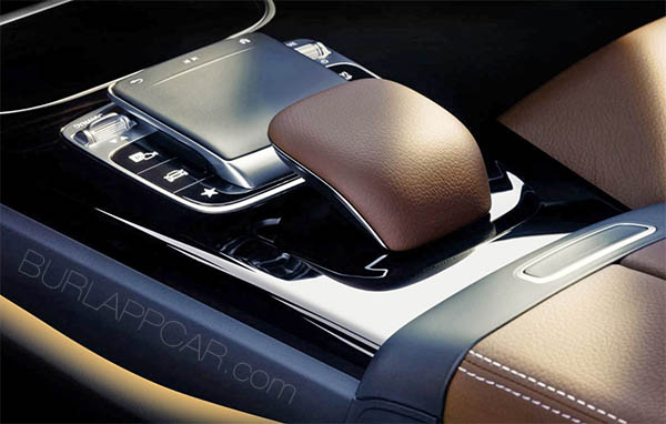
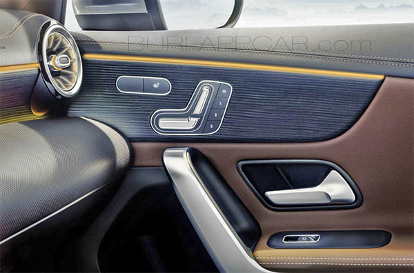
Materials and details all seem to be getting a huge upgrade. This is now more worthy of a luxury brand.
I remember the CLA being criticized a lot when it came out for its “non premium” interior.
This is much nicer. And actually visually interesting.
But I also wish it was a bit simpler. There are now tons of shapes and textures fighting for attention…
As a reminder, here is the current interior.
Which now looks pretty old.
What do you think???

Such an upgrade!