2022 Honda Civic Hatchback: cleaning up the mess
Last Updated:
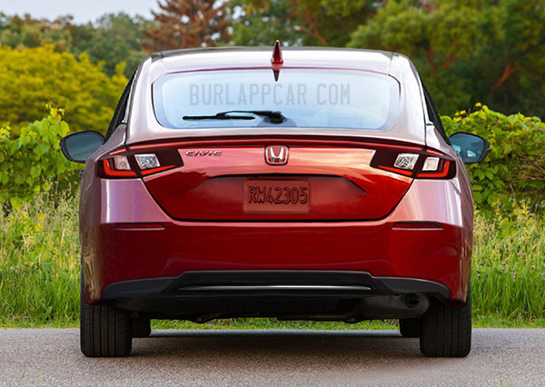
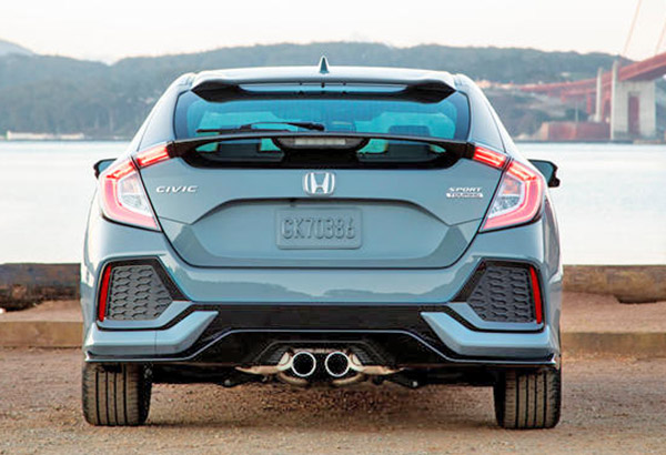
When comparing the 2022 Honda Civic hatchback. (top) to the current model, it is obvious the new one will be a much cleaner, grown-up design. I guess Honda finally figured out the current generation was just “too much” for most buyers.
The spoilers, the wings, black plastic trim everywhere, fake vents are all gone. Of course, the next generation could be considered boring by some next to the current one. But it might also appeal to people who are not on drugs all day long. People who actually buy cars.
I really hope the cleaned-up version will be more popular. And I really think, as mentioned previously, they should offer a hybrid version of the hatchback. Which would really give it a chance to stand out and be more appealing.
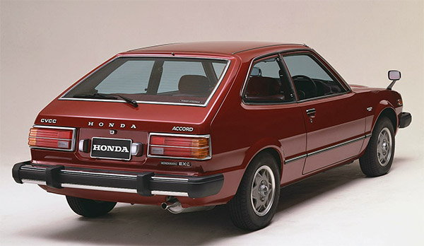
For some reason, the clean design of the 2022 Civic Hatchback reminds me a little bit of the cool first-generation Accord coupe. From a time when Honda designs were much cleaner …


Not seeing the resemblance to the 1st gen Accord, but I do believe the smoother simpler design is much more attractive at least from the rear view anyway.
yes, better than the godawful current one. but my biggest problem with this is that it's grown way too large, and while I appreciate the restraint, I find that tail extremely dull. It looks as though the got inspired by Mazda and went for a sad version of a Mazda tail.
Yes way too boring. And wouldn't be surprised if the interiors are becoming even more generic as they did in the last generation (and in the current Accord).
Terrible new design. They turned it into a freaking Chevy.
Definite improvement from this angle, but will it look like a pinched bean from the side?
That Accord was notorious for engine failures at 50,000 miles, but it still managed to put Honda on the US map, which the Civic didn't.
It's odd how much taller side windows used to be–many pre-2000 sedans look freakish now.
Is this real, or just fan illustration?
Now it looks like an old Saturn from the back. The last generation would look okay minus the fake plastic vents.
current design is UGLY. new design is boring. It's a honda. It will still sell. Funny though, travelling in countries outside of USA and Canada and Civic not very poplular. Remember going to Peru for 2 weeks and seeing only 2 civics.
The picture of the first-gen Accord brings back memories. In 1976, a few months before I married my first wife, she bought one of the first Accords. It was so different from anything that I had driven. The manual shifting was so smooth! And it cost only $3,999. My how things have changed.
I love that first Accord too. It might be an obscure reference, but it is prominently featured in the 1979 film "Time after time". Which is one of my favorites.
As for the 2022 pic, I was told it is real. But I'm not so sure…
Wonderfull the 1978 Accord. The first Honda I saw in person when I was a child. I remember that I felt something completely different and the impression was stunning in every detail
That first Accord was my first car (bought used when I first got my license in 1999), and it was a beauty. Manual choke gave me a few flooded engine incidents and the wheels were basically pizza cutters, but it was such a sweet little car especially with the 5 speed manual.
Perhaps a bit of an overcorrection, but a massive improvement nonetheless.
Think the present car could be cleaned up a bit but the replacement is boring. But I guess that's what Japanese car buyers want.
Ugly design, looks like a mini Accord. Grandpa style, with chicken wire vents inside.
So true bto
I guess you all may not remember that the first gen Accord rusted like a screaming banshee…you could poke your fingers through the top of the fenders within 3 to 4 years….at least in New England where I live.
I agree. They took the sleekness out of it. It would've been better as a cleaner evolution of the current design. The headlight and taillight design is goofy, and the proportions are weird overall.
Yeah I don't like it. I really dislike the headlight/taillight design. While the Type R may have been a little overstyled, I liked the overall sleek aggressiveness of the current si. the new one seems to lack that completely.