2021 Toyota Camry: a closer look at that horrible new screen.
Last Updated:
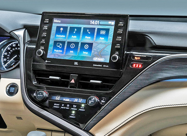
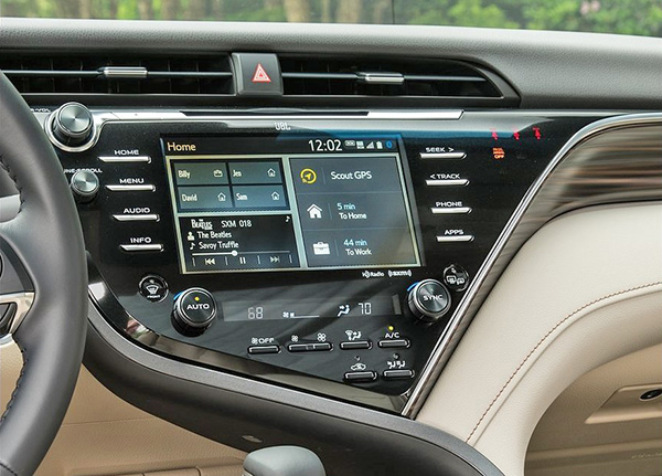
Here are closer pictures of the Camry’s screens. The new 2021 model is on top.
And it looks even worse up clos! Like a few people noticed in the comments, Toyota kept the same top part of the dashboard. And the space for the old vents is still there. Now with nothing. (Just collecting dust I guess…)
The whole thing looks much cheaper than before.
The previous screen and surounding design actually looked pretty modern and classy. And there was plenty of room for an even larger screen by moving some switches around or include them in the larger screen..
The new one doesn’t look that much bigger anyway.
For some reason, the new set up has to be saving them some money. Not sure how, but saving a few dollars is usually the reason for stupid moves like this…


hideous
Absolutely right. Huge regression, looks like crap.
I like it.
Improvement in ergonomics. The screen is higher and the driver doesn't have to search for it in a cluttered area that is lower. Only the weak minded and poofters prefer form over function.
This is so lazy. I'm sure this exact screen is shared with some other Toyota product. Absolutely no other car company would get seay with this, either. Not without huge pushback from the automotive press. Toyota literally just plugged the hole where the vents used to be.
Vince, how do you allow vulgar losers to post their filth?
I will reserve final judgement until I see it. It definitely isn't as well integrated as before though. I can see the ergonomic benefits.
I hate the tablet screen look in all cars. I'll be glad when this style trend fades away.
Who actually buys Camry's anymore?
Ok.
Vince, I have been reading and visiting your blog since the beginning. First, I used to take pleasure in seeing the awful renderings of future cars you used to post. Then you evolved into posting the type of content you post today: news, commentary, and reviews. Really enjoyable stuff.
I am requesting that you remove or edit the comment at July 16 @ 3:23. I had not even heard of that pejorative until reading it here. And the poster at 3:58 is right. This is not the sort of thing that should have any place here (or anywhere).
It's your choice whether you want to post this or not – my intention was to let you know my thoughts and hope that you would use some discretion as you moderate these comments going forward.
Seems they removed the cd player as well, for further cost savings
Some manufacturers may be expecting market forces will require ever larger screens, as they have with transmission gears.
Or a corporate big&tall-wig complained the old screen was too low.
I wonder if there was a glare issue with the original screen.
Fuck off with your poofter comment. Disgusting.
More people than literally any other sedan…