Polestar 3: interior details…
Last Updated:
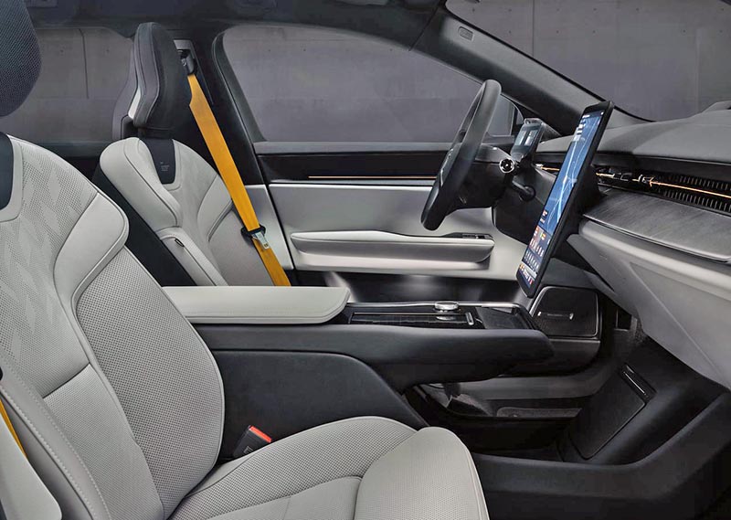
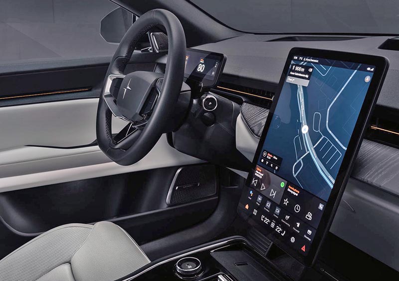
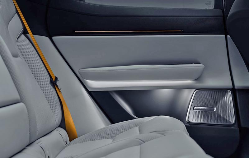
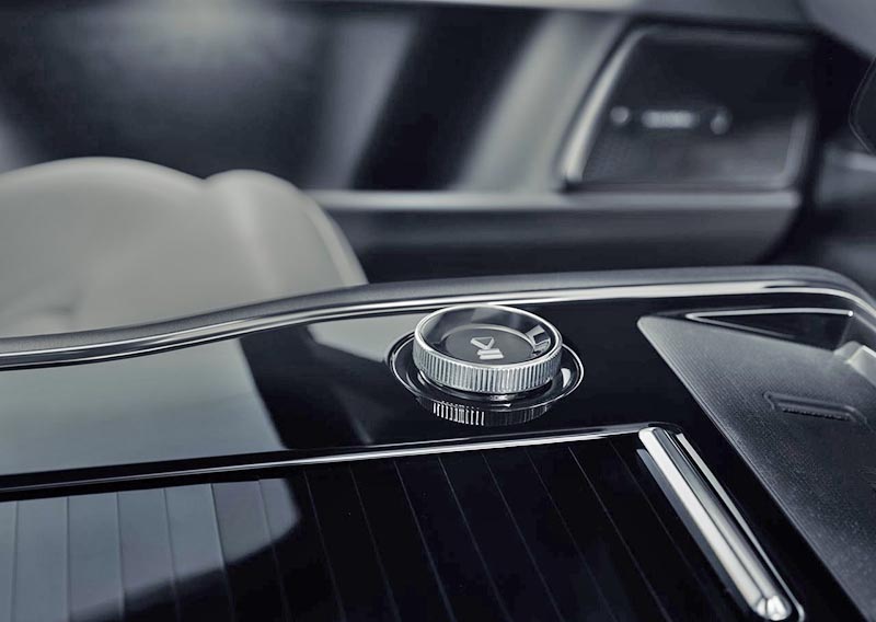
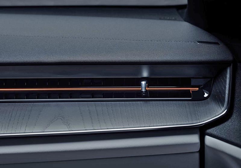
The new Polestar 3 electric SUV does have a very nice interior. This is far better than the horrific BMW iX interior. But it doesn’t seem that much better than the Audi eTron. Which has a very luxurious and upscale interior. And starts at $15 000 less…
To me, the main problems with the new Polestar 3 are the screens. The big center vertical screen doesn’t really scream luxury or original anymore. Not only does it look like the one in the Polestar 2, but also the Mustang Mach-E. Both are much cheaper cars. It’s almost kind of old these days.
And I really wish manufacturers would find a way to incorporate the smaller Driver Info Center screen into the dashboard design. Again, like the Audi. And many more. But the Polestar has this little rectangular screen just stuck there behind the steering wheel. It’s a really cheap and ugly trend. Again, they’re not the only ones. All new Mercedes interiors have it (Unless you opt for the crazy-priced HyperScreen option). The little phone-size table behind the steering wheel just looks too cheap for an $85 000 car.
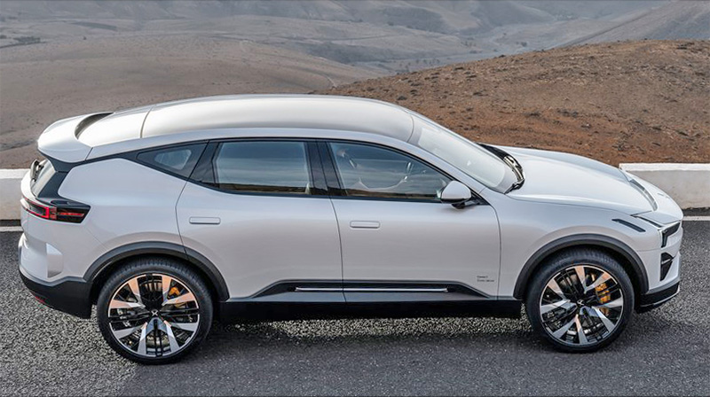
I’ll just repeat what I said earlier: the Polestar 3 seems very nice but is overpriced. By at least $15 000 ( Yes, I did mention $20 000 earlier…)
On another note, this makes me think of the wide price difference between the $66 000 Tesla Model Y and the $121 000 Model X. There is a huge opportunity there for a new model (or even more) in between. If people are into $85 000 electric SUVs, Tesla would clean up in that even more lucrative segment than the Model Y. I know they can barely produce enough cars. But how long can they go without any real new models?

Fisker Ocean will be a better choice
Fisket Ocean will be a better choice