2025 Genesis G80.
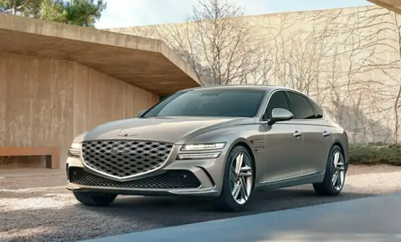
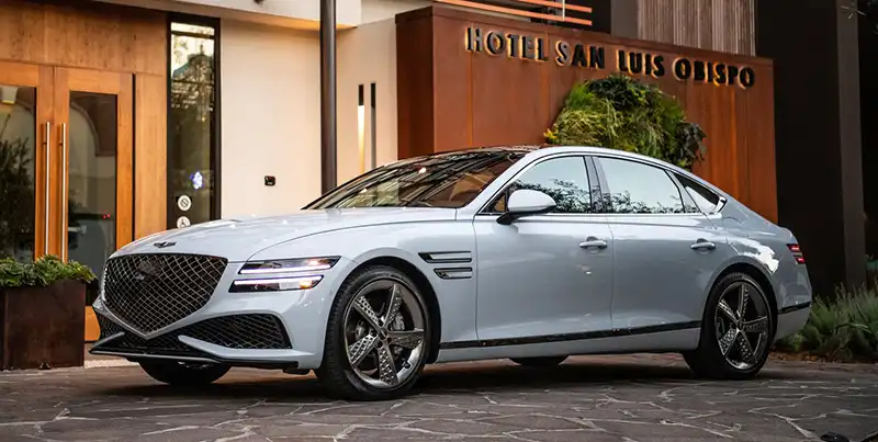
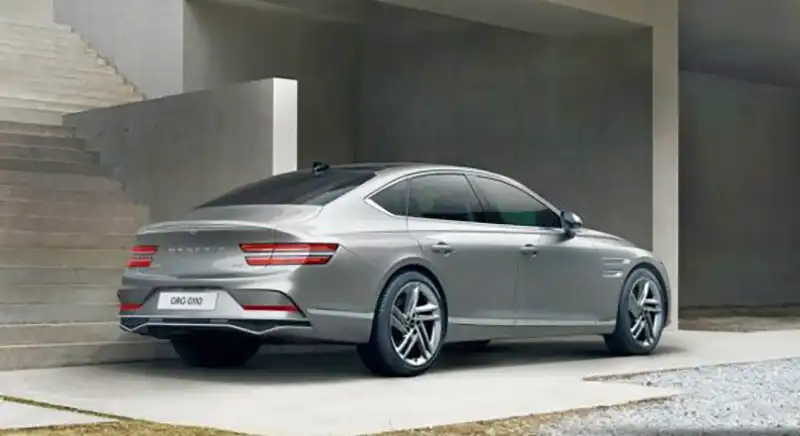
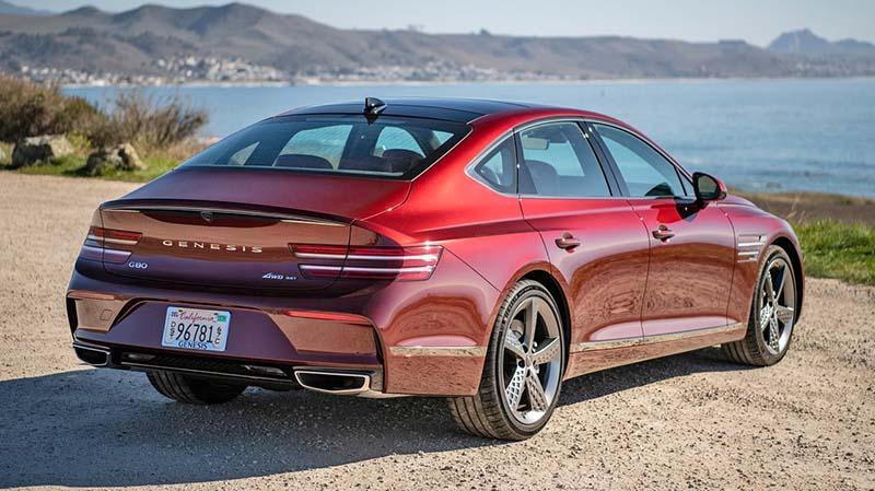
Just like the Genesis GV80, the Genesis G80 sedan is getting a refresh for the 2025 model year.
As you can see, there isn’t anything really “refreshed” outside. A few small differences here and there, upfront and in the back. The exhausts now have a weirdo triangular shape, and the ghastly huge and ridiculous grille is still there.
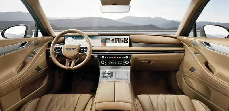
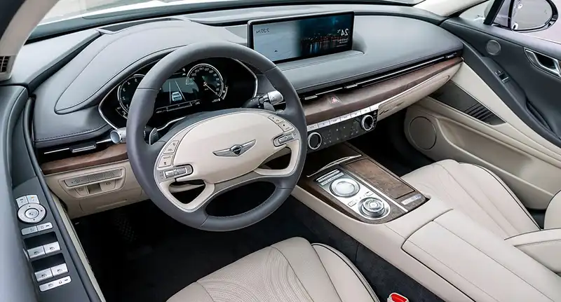
The revolution is taking place inside. Where the excellent interior of the G80 has been ruined by the addition of a much cheaper-looking wide screen and revised console. I saw the 2025 GV80 in person, and that new setup looks much worse than what they had before. Genesis was really pushing the envelope and had fantastic interiors. I am sure they save a bunch of money with the new screen but they now all look like big Hyundais. Which defeats the purpose of having created a luxury brand in the first place.
The screen itself looks the same as the one in the new Hyundai Kona. At least the one in the Santa Fe is a bit curved, while the one in the GV80 isn’t. And the controls under the dash look a lot like the ones in the new 2024 Santa Fe.
At over $ 56,000 to start, the Genesis G80 sedan is only about $2000 cheaper than the Mercedes E-class. The new 2024 E-Class has a vastly superior interior, and it’s a Mercedes! (Although the 2024 E-Class will probably cost a bit more)
No one can really predict a brand’s freefall, but I can tell you these new Genesis interiors are not an improvement at all. While the competition is trying to design even better and more luxurious interiors, Genesis is making theirs cheaper and more generic-looking. Which, in my opinion, is a very, very bad idea. Especially for a new brand that has so far been trying hard to make a great first impression in the market.
Good luck…