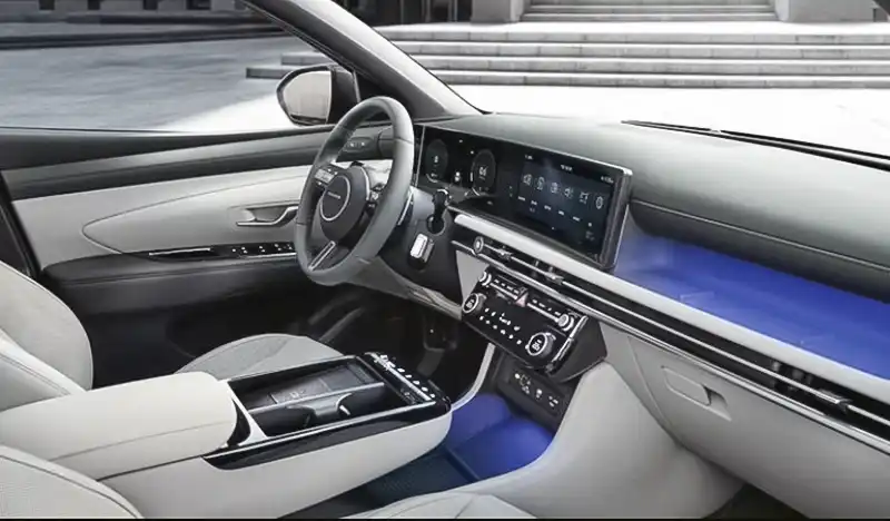
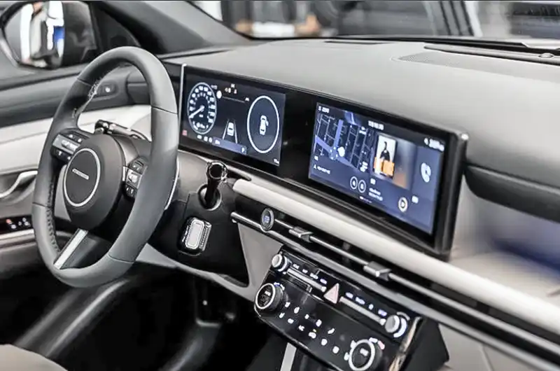
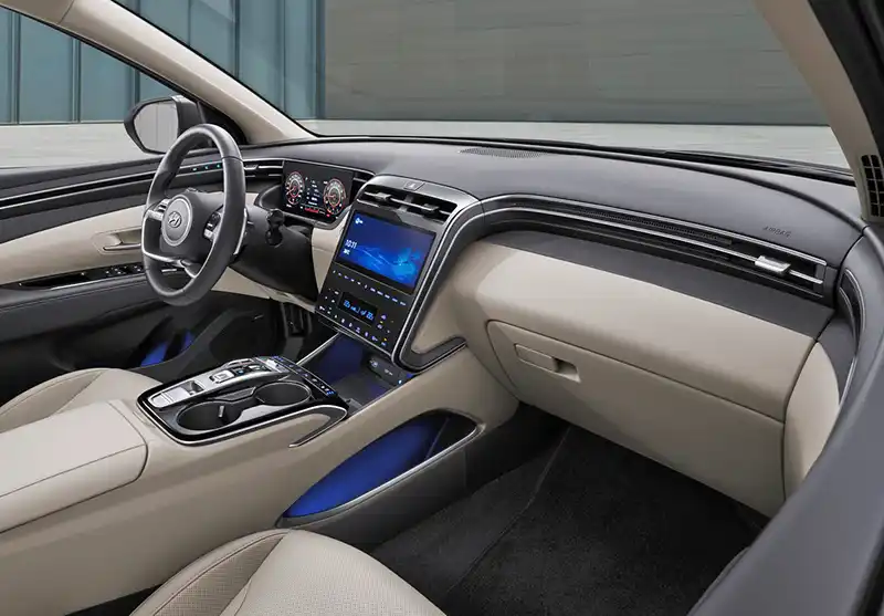
2025 Hyundai Tucson interior.
Last Updated:


This might be tough to say, but I truly think Hyundai has just ruined the Tucson‘s interior for 2025.
The refresh includes the usual unnecessary modifications to the front end. But at least that’s not looking too different.
But the new interior is just a very sad sight for anyone who enjoyed the current design. Which, in my opinion, was maybe the best in the segment. Classy, original, and modern. Everything the new one is not.
The new interior looks vaguely familiar. A little bit like the new Hyundai Kona. The screen and HVAC controls seem to be lifted from the new Santa Fe. This was unnecessary and quite shocking from Hyundai since they’ve been coming with so many interesting and original designs for the past few years.
In more sad news, next year’s Hyundai Santa Cruz will be getting the same interior. This means, that if you were thinking of getting a Tucson or a Santa Cruz, get it now! They are probably gearing up for even better deal as the revised version is around the corner.

The main issue with the pre-facelift interior is that there are no physical buttons on that center stack. I wish they had just revised it to add the physical buttons and then it would’ve been perfect.
Agree with PJ. The pre-facelift was actually pretty brutal to use without physical buttons. I actually like this, with one exception. WHY, WHY, WHYYYYYYY did they use this awful steering wheel. The one on the new Sante Fe is AMAZING and would have been sweet here. Instead they used the wheel from the Kona, which is the dorkiest looking steering wheel around. If they had just replaced the HVAC unit with this new one, and put on the Sante Fe steering wheel this would have been perfect
Keep the old steering wheel, add the physical buttons, maybe some minor trim changes. That’s all it needed.
The old steering wheel was awful as well
I’ve come to realize Hyundai has difficulty making nice looking steering wheels. The 2-spoke deign on the current Tucson is awful. The 3-spoke refresh is terrible. The pre-refresh Genesis 2-spoke wheel destroyed the otherwise beautiful interior. The Sante Fe is the only wheel that is decent.
I’m sick of the new wide screen dashboards. At first glance this could be the new Mustang dash or any other of many vehicles. A drivers duty is hands on the wheel, eyes on the road -NOT playing a Xbox/Nintendo/Gameboy. All that digital screen toybox crap is for the passengers. The joy of driving is engaging the road, NOT playing games.
I actually think they did a great job with this updated interior. I do agree that the current interior was attractive and mostly cohesive however it lacked practicality that made it a tough sell against the CRV and RAV4 mainly for its lack of storage up front and very few physical buttons. Adding more cubby space in the center console plus the shelf above the glove compartment is a smart move!
Besides the touch buttons, at least aesthetically speaking, the current Tuscon was among the best interiors of it’s class. The refresh has some real almost tacked on elements by comparison. Especially where the climate control/audio/settings buttons are concerned. That, and I personally hate the new column shifter that seems to be making it’s way to every Hyundai model, EV or not.
I couldn’t agree more – the current Tucson interior looks so much more bespoke, and IMO even a bit more modern. THis looks like it came straight form the smaller Kona, not a good thing.