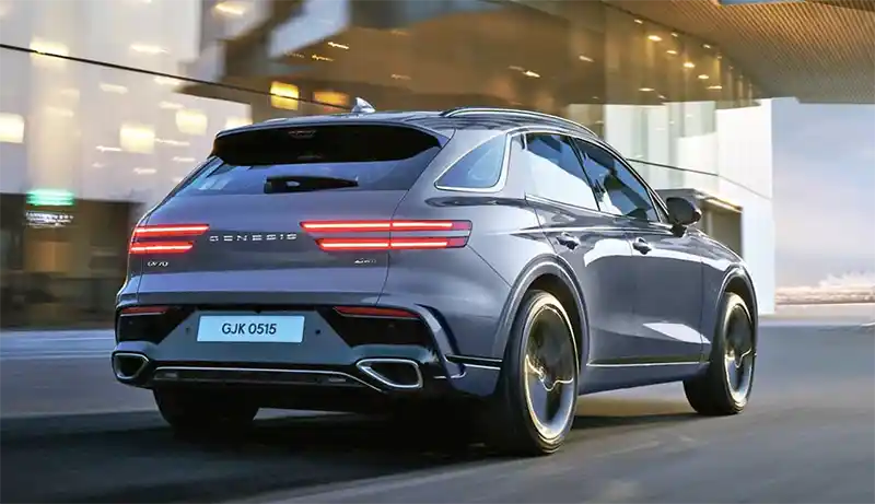
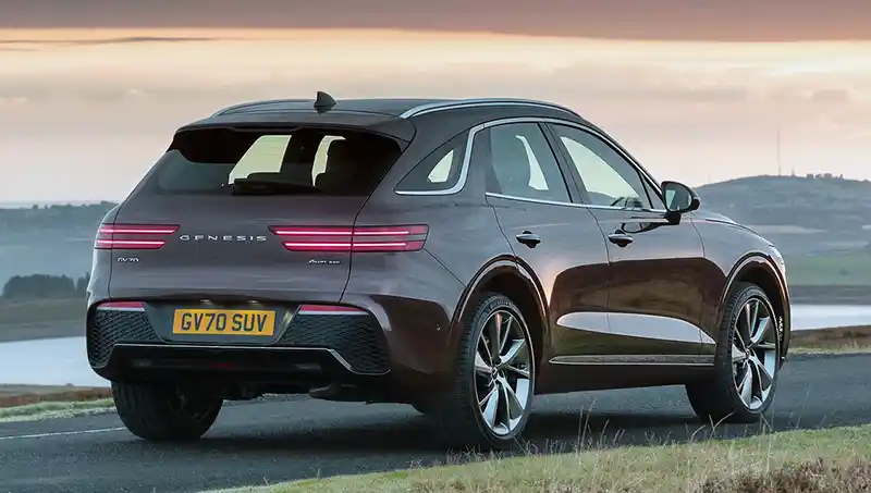
Genesis GV70.

Last Updated:

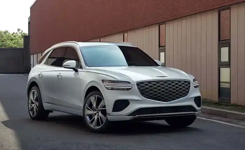
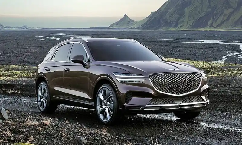
After the GV80 and G80, the Genesis GV70 will be next to receive a few changes for next year.

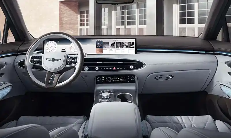
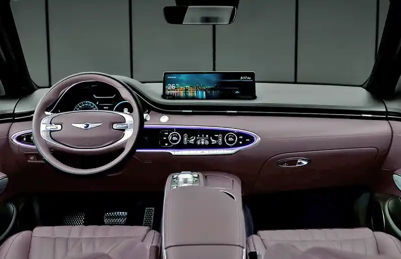
And just like in the larger GV80, these changes are either pretty terrible or useless. I saw in person the revised 2025 Genesis GV80 SUV. Where the really nice dashboard design has now been replaced with a cheap-looking BMW-like widescreen. The screen itself looks like it’s just stuck there and in general, doesn’t look any fancier than what Hyundai offers in the new Kona.

The console was revised to with a flatter look and strange-looking trim. The whole thing looks not only worse than before but cheaper too. It seems to be the case also with the revised GV70. That exact same screen that is now used everywhere, and again, the same console.

It is baffling to see a company that quickly introduced many really nicely designed vehicles with truly luxurious interiors, blowing it by what it looks like trying to save a few bucks on much cheaper-looking interiors.

Trying to copy the terrible screens in new BMWs is not a good thing. The previous center screen in the current GV70 never looked great, but the new one just doesn’t belong there at all.

It just all seems very strange as if Hyundai was having a very hard time improving things once they’re really good. Like if they have to take a step back and not make things truly great. They did the same thing with the new Tucson interior.

Why???

Conversation 6 comments

  1. Terrible. Why are they trying to ruin a perfectly good interior? If you are just going to throw on a flat rectangular tablet on your dashboard, it will look awful and tacky.
    Cadillac and Buick are the only ones doing curved screens that aren’t rectangular – they actually have a shape to them. Even Chevy, which uses 2 separate screens, look much better integrated because they aren’t just rectangular slabs. It amazes me that GM isn’t getting more credit from the press with how well they are integrating their screens.

  2. An interior made up of flowing curves, oval themes and they just tack on a big rectangle? Why not come up with an oval mount for the screen (keep the actual screen rectangular, of course)… mimic the lower black oval where the climate/radio controls are located..

  3. You can probably blame Mercedes for the influx of this type of screen most manufacturers are now emulating. It’s lazy engineering and definitely NOT an improvement aesthetically.
    That said, at least the HAG is consistently refreshing, redesigning, and even introducing new models to their lineup, which is more than can be said by Toyota these days.

  4. I work in the automotive sales at Genesis/Hyundai, and the unfortunate reality is that customers want larger and larger screens, even when it means trading off an excellent interior design. The same thing happened with phones, as they lost there practicality and ergonomic design and had it all replaced with larger and larger screens with smaller bezels. It isn’t ideal, and I for one adore the current design, but many customers, rich or poor allude screen size to luxury, in lieu of excellent design.

Leave a comment

Your email address will not be published. Required fields are marked *